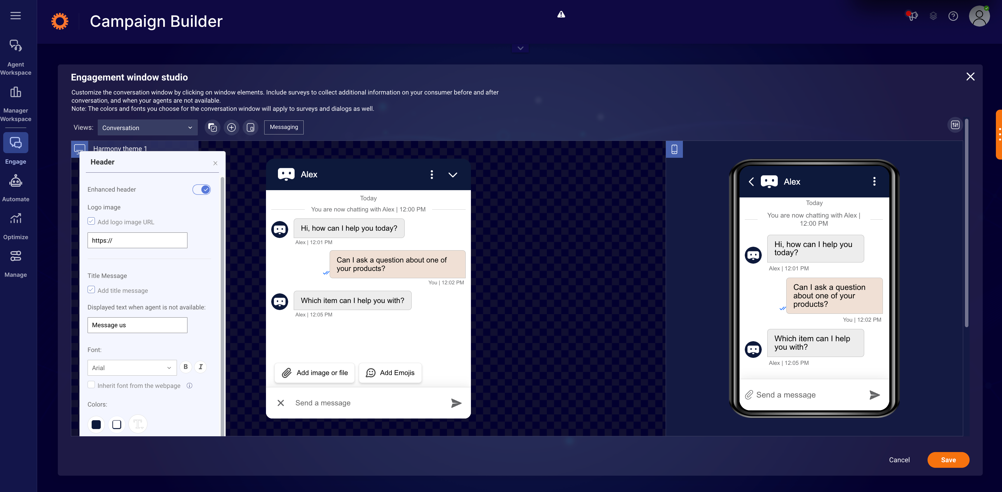
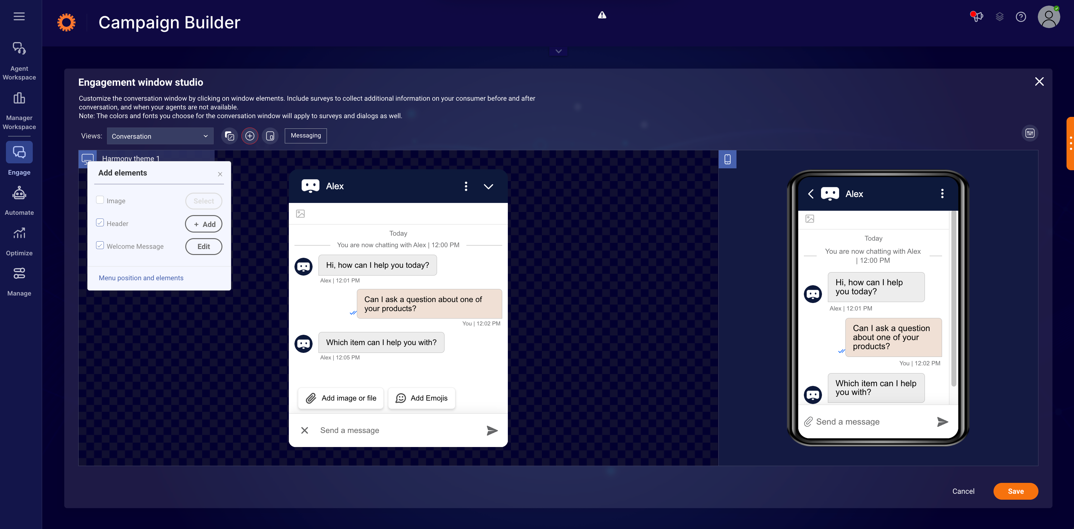
For Web Messaging, the engagement window hosts the conversation. In the engagement window studio, brands can fully customize and tailor the window, with control over every aspect, from fonts, colors, style, branding and more.
Using the Engagement window studio, you can:
- Customize the look and feel of the conversation window
- Edit a window header, configure a picture of your agent, or add another image to the window
- Add and edit surveys
- Customize the consumer actions menu
- Leverage file attachment and emoji menu
and more!
Engagement window studio basics
To provide a consistent experience across devices, you can design identical engagement windows for both desktop and mobile versions of the platform. Using the Engagement window studio, you can design a conversation window once and use it across any number of engagements.
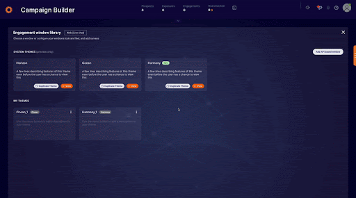
Accessing and Customizing Themes in the Engagement Window Library
- the Engagement Window Library.
- In the top row, you’ll see our three system themes: Ocean, Horizon, and Harmony (latest!).
- Click View to open the Engagement Window Studio and preview the default design and color palette of the selected system theme.
- Click Close to return to the Engagement Window Library.
- Click Duplicate to create a copy of your preferred system theme.
- From the three-dot menu on your duplicated theme, select Edit theme design to start customizing.
- The Engagement Window Studio will open, allowing you to fully customize your engagement window.
➡️ In the Engagement window library, you can delete window designs that are not in use by clicking the Action menu and selecting Delete. In addition, you can set a default window design by clicking the Action menu and selecting Set as default. To see which campaigns are using each window design, hover over the link icon.
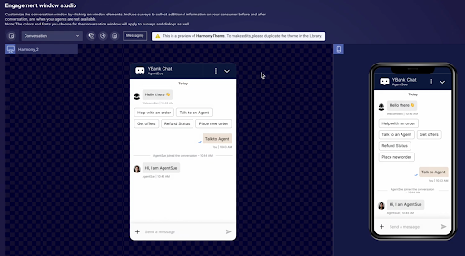
The Engagement window studio allows you to customize the look and feel of both web messaging and mobile web. Any change you perform to the design of the desktop window takes effect in the web mobile window as well.
To edit the window name and description:
- Click the window name (in this example, Support)
- Enter a new window name and type in a description, the window name and description will display in the Engagement window library to help you identify different items in the library.
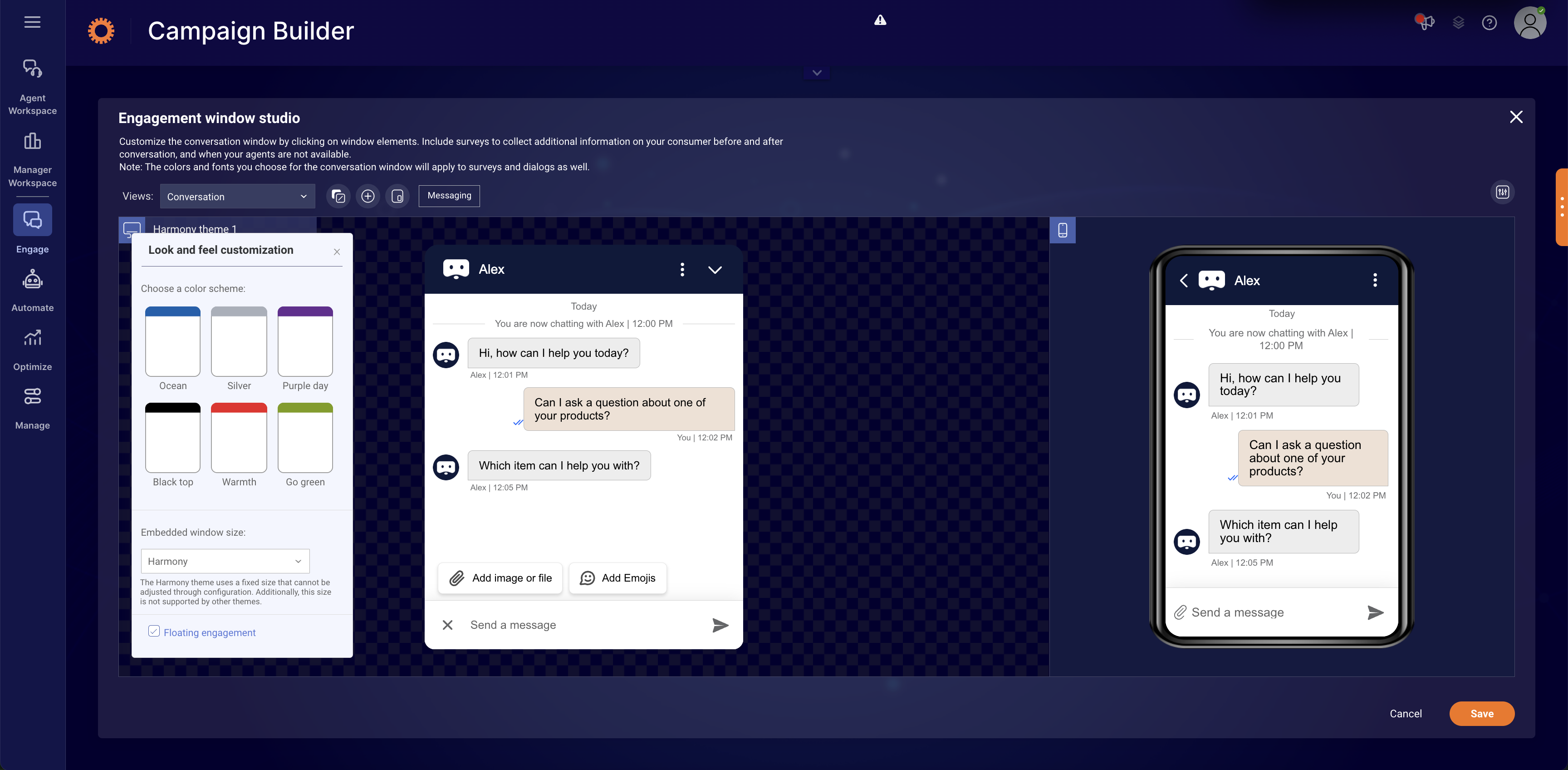
Customize the look and feel
To select a predefined color scheme for your window:
- Click the Look and feel customization button
- Select your preferred theme, you can choose a theme and use it as a base for further customization
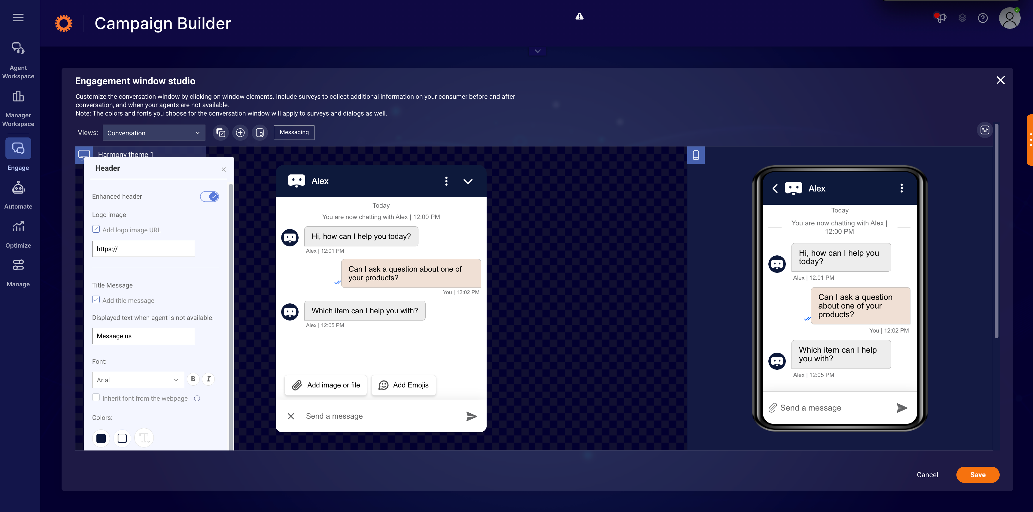
To customize conversation window elements:
You can fully customize the conversation window to suit your brand by changing the colors, fonts, visitor bubble, agent bubble, system messages, info line and window background. Select each of the window elements and follow the steps below:
- Click on an element
- From the properties window, customize the element according to your brand
- You can change the icon set of some elements to suit the background, we recommend choosing bright icons for dark backgrounds and dark icons for bright backgrounds
➡️ The background color is the same as the messaging window background
Text is the same color and font as the Automatic Messages or can be customized individually in the Engagement Window Studio
Buttons have the same look and feel of the title bar
Harmony theme
The new Harmony theme has been introduced as the new default engagement window for Web Messaging engagements, impacting both desktop and mobile web experiences. Harmony delivers a modernized enhanced consumer experience along with expanded functionality.
The new Harmony theme features:
Window Header
- Menu - Menu button is now vertical, Remove "make urgent", Add Clear History
Conversation Area
- Metadata Formatting - a pipe “|” instead of dash “-”
- Messaging Bubbles - Same rounding for both. "Drop corner" only displayed for latest message. Less space between groups of messages sent within the same minute.
- System Messages - Message and timestamp are in one line with horizontal lines to the left and right
- Transcript Design - Updated margin sizing / font / text positioning
- Quick replies look & feel - Squared off (similar radius to messaging bubbles)
- Window Size - Taller than Horizon theme. Harmony window sizing is 390w x 700h
Input Area
- Add to conversation - merged into one place both file attachment and emoji
- Emoji Menu - “+” button that switches to “X” button once opened , Add "+" image
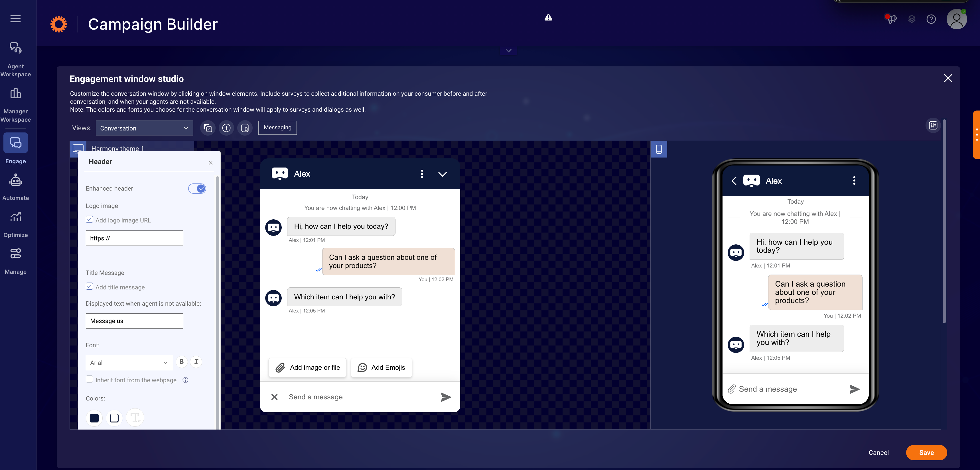
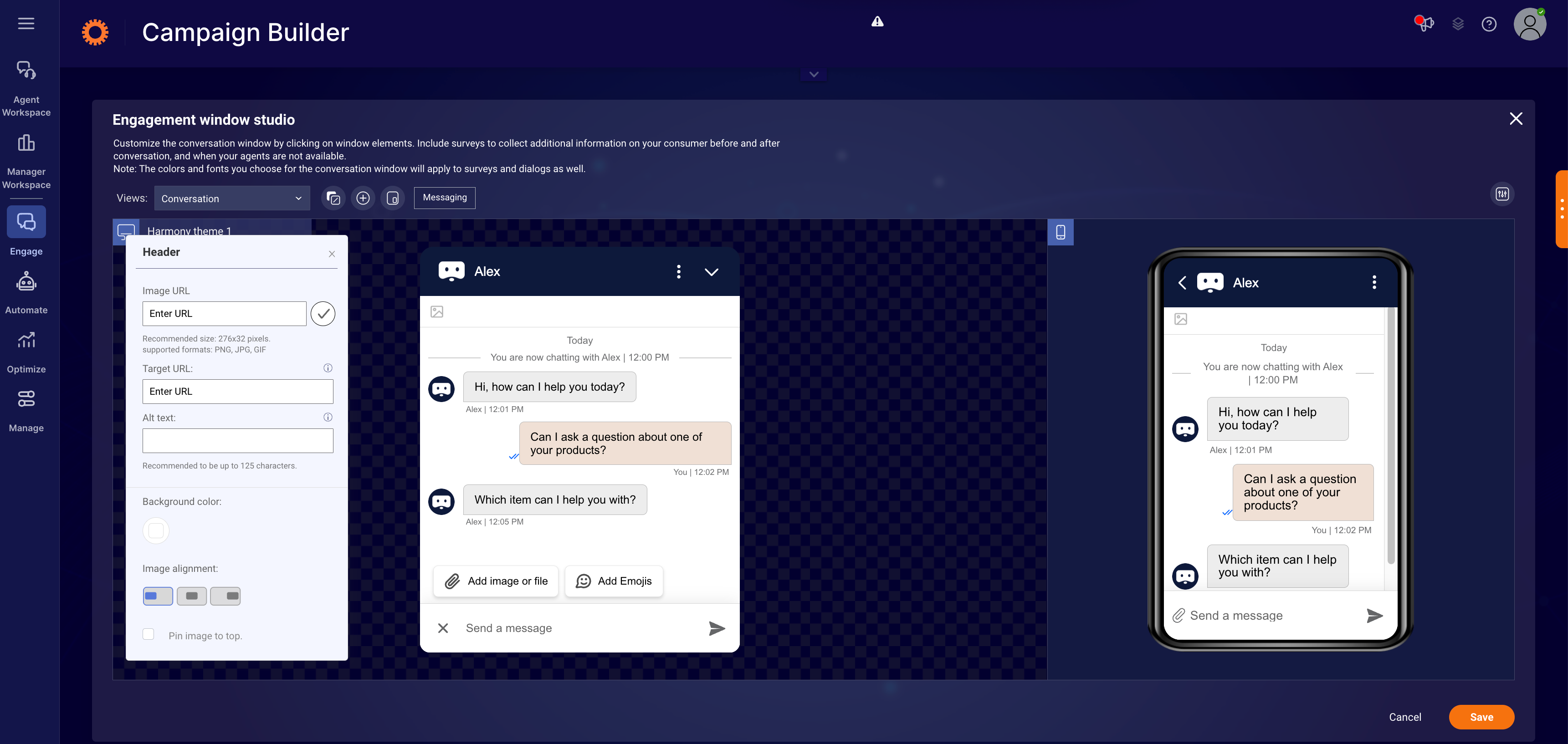
To add a header to the window:
- Click the Add Element button
- Click the +Add button
- Insert the URL of the image
- Click the checkmark button to save
- Insert a Target URL that will open in a new tab when the header is clicked
- Add alternate text that will display when the image fails to load, or for visitors who require visual aid (this ensures the header meets accessibility standards)
- Choose a background color, if you’d like
- Set the position of the header: left, right or middle
- Choose between pinning the header to the top of the window, or letting it scroll up during the conversation
To add an image to the window:
- Click the Add Element button
- Click Select to add an image
- Select an image from the Gallery or click Custom to add your own image
- Choose a background color, if you’d like
➡️ If you upload images with a height of more than the above recommended sizes, the system will resize to fit the height above, while maintaining the ratio of the image. If the width of the image is greater than the widget of the window, it will align to the right. If there are any custom css changes you want to make in the header or images section, please refer to lp_css_customization taglet. Below are the recommended sizes:
For Images:
Horizon: 338 x 107 pixels
Ocean: 276 x 92 pixels
For Header:
Horizon: 338 x 41 pixels
Ocean: 276 x 32 pixels
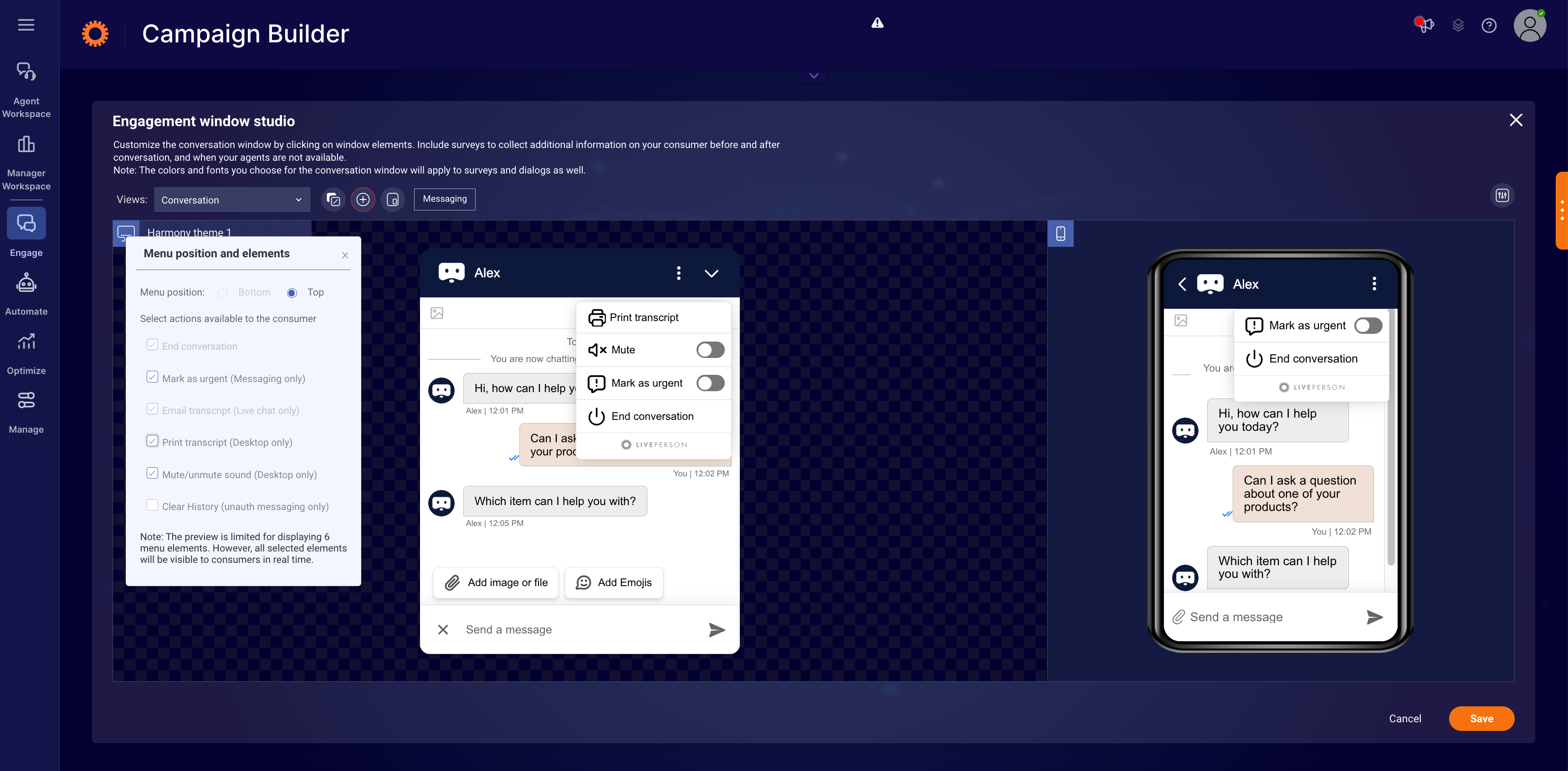
To add additional functionality to your window:
- Click the Action menu button or click the + button in the desktop preview.
- Select the action buttons that you would like to add, e.g., email transcripts. A preview displays on the screen.
- To change the color of the Action menu, click the actions area in the chat window. The action window will open.
- Change the font, background color and/or icon color (dark or bright), as desired.
To add and edit surveys:
Click the Views drop-down menu to view the list of surveys. Then do one or more of the following:
- Click a survey enable button to enable and edit it
- Click a survey to edit it
- Click a question to edit or delete it
- Click Add Question to add a new question
➡️ Note: surveys and dialogs inherit the main chat window’s colors
The background color is the same as the chat window background.
Text is the same color and font as the Automatic Messages.
Buttons inherit the look and feel of the title bar.
Set the embedded window as floating
Brands have the ability to set the embedded window as floating. Once this configuration is enabled, the position of the window will be 20px from the bottom and 20px from the right. This feature is disabled by default.
Enablement
- Log into the Conversational Cloud
- Go to Engagement window studio
- Click on “Look and feel customization” button
- Enable by clicking on “Floating engagement” checkbox
- Click on “Save”
Limitations
- This setting will impact only the desktop embedded window.
Configure floating engagement window in engagement window studio:
Floating engagement window consumer view:
Emoji support
Brands have the ability to configure whether to provide consumers the ability to add emojis to their conversation while using the engagement window on their desktop. This feature is disabled by default.
Limitations
- This feature is available for desktop only.
Enablement
- Log into the Conversational Cloud
- Go to Engagement window studio
- Click on “Text area” section
- Enable by clicking on “Emoji icon” checkbox
- Click on “Save”
Consumer view: adding emojis from desktop Web Messaging or chat window
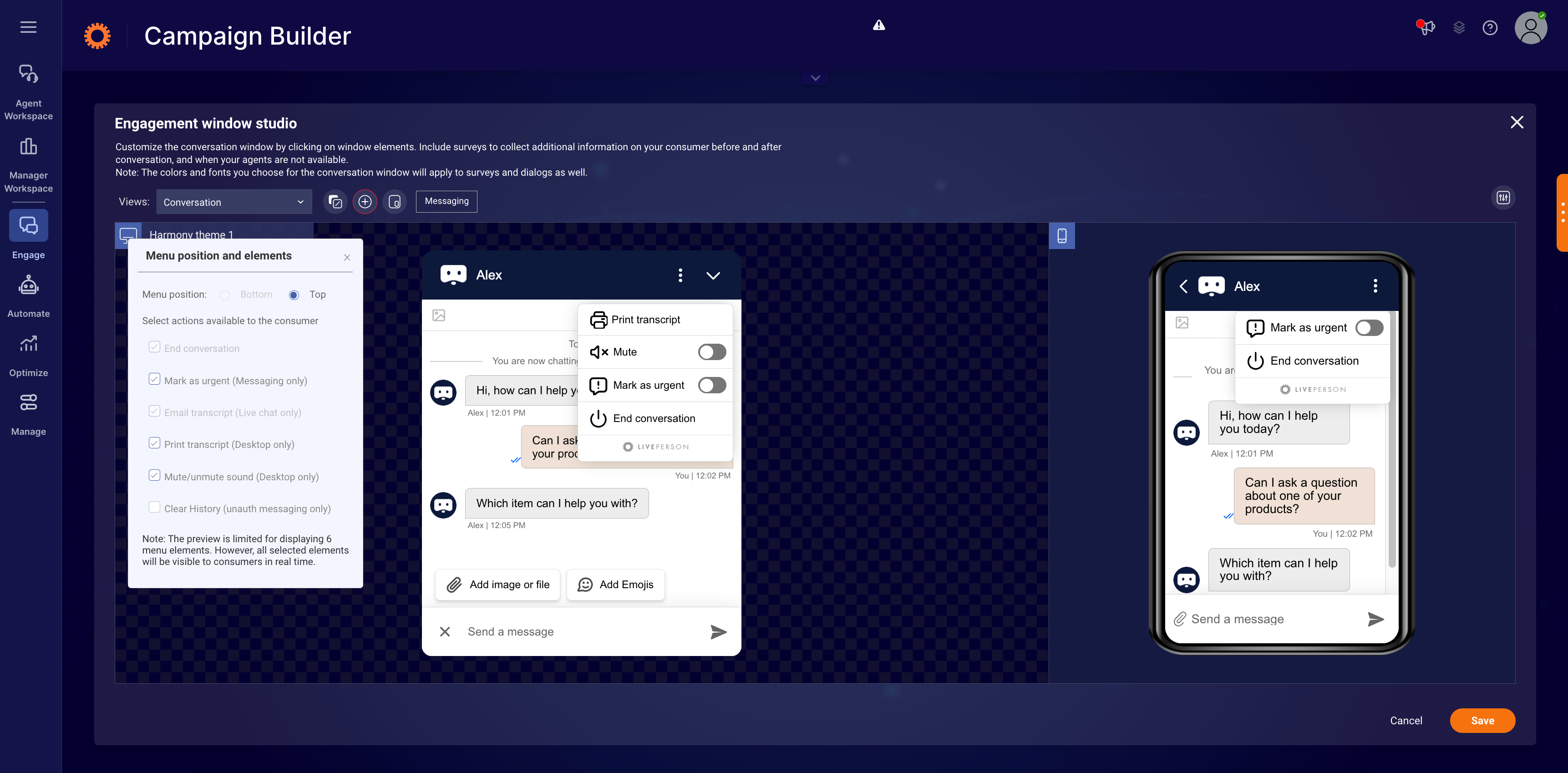
Consumer actions menu location
Brands have the ability to set the consumer actions menu location and elements within the Web Messaging or live chat engagement windows.
There are 2 options to set the location of the menu:
- At the bottom left side of the window (current location and default for Ocean and Horizon themes)
- Top right of the window, instead of the X icon
If the top menu option is selected, the menu icon will replace the X icon (close/end icon). If the consumer would like to end the conversation, they can do so by choosing the end conversation option from the menu.
Enablement
- Log into the Conversational Cloud
- Go to Engagement window studio
- Click on “Add elements” icon
- Click on “Menu position and elements”
- Under “Menu position and elements” section, select the position of the window
- Click Save
Limitations
- The top menu position is available for Web Messaging only and will not be visible in the engagement studio if the window is set for chat.
Configure the location of the menu for the engagement window:
Not configurable
Add attachment icon to the input area
When the menu is configured to be at the top for Web Messaging and file sharing is enabled, for the account, the attachment icon is displayed at the consumer text area. Brands have the ability to configure the visibility of the attachment icon within the engagement window. This will be enabled (visible) by default.
Advanced window configuration and customization
In addition to the styling options within the window configuration, you can make the following advanced configurations:
- Dialog button styling - change the style of the primary and secondary dialog buttons in the engagement window to match your brand design guidelines
- Window icons - customize the top bar by choosing from a list of emojis. The 'Send' and 'End chat' are in the style of the window

Available customizations:
- Agent picture - make the conversation more personal by configuring the agent’s picture to display in the engagement window
- Rounded or square window corners - control the exact radius of the window corners to produce a rounded or square effect
Agent picture configuration
- In the Conversational Cloud, go to the Users tab
- Click on the row with the relevant agent’s name to edit their information
- In the “Picture URL” field, add the URL of the agent’s personal picture

Click Save
➡️ URL must be in “https” format, with recommended size of 200x200 pixels (up to 0.5MB), supported formats are PNG, JPG, and GIF
Defining agent picture appearance in the engagement window
Agent picture is defined individually per window. If you are using the same window in different engagements/campaigns, visitors will see the agent’s picture in both of them.
In order to define the agent’s picture in the selected engagement window, follow these steps:
- Select the desired window from the Engagement window library
- In the Engagement window studio select Open additional window settings
- In the look and feel dropdown find the agent picture row
- In the value column, select Yes from the dropdown menu in order to enable agent picture for the selected engagement window
- Click Save

Now the visitor will see their agent’s picture next to each line sent by the agent in the chat engagement window.
➡️ In the case that the agent picture is enabled for a window but the agent did not configure their picture yet, the visitor will not see any picture while chatting with this specific agent.
Configuring a default picture
In order to define a default picture to be displayed when no agent picture is defined, follow these steps:
- Select the desired window from the Engagement window library
- In the Engagement window studio select Open additional window settings
- In the Engagement window category, locate the Agent picture default URL row
- In the Value column, add the URL of the default picture to be displayed for agents who did not configure their picture
- Click “Save”
Visitors will now see the configured default picture beside each line sent by the agent with no configured personal picture.
Limitations
- Join conversation: If a second agent joins the conversation for whom a default picture URL is defined, the visitor sees the default picture next to second agent’s lines.
- Because each window is configured separately, take into account the following: In the case that different default pictures are defined in different engagement windows, when an agent transfers the conversation to an agent that has no assigned picture, the default picture displayed is the default picture defined for the conversation’s original engagement window. This is relevant to accounts using separate engagement windows for different departments.