The Conversational Cloud is now seamlessly integrated into LINE, offering your brand the opportunity to tap into the millions of consumers connecting on it. Set up is easy and allows your agents to create ongoing connections with valuable customers right away; to onboard LINE to your account, please contact your LivePerson account team.
Why use LINE to connect with your consumers?
- Direct access to the millions of consumers — There are more than 217 million monthly active users on LINE. Be where your customers are and start connecting with them on the channel of their choice.
- LINE application available for every smartphone — The LINE app is accessible to every one of your customers, whether they’re using iOS or Android.
- Be where your consumers need you — By adding a QR code to an invoice, email, or advert, brands can allow consumers to initiate a conversation with an agent via LINE.
- Easy bot integrations — Bots can offer service and sales assistance to customers directly through LINE, with a seamless transition to a human agent available as and when required.
- Rich Conversation capabilities - High-resolution photos, files, stickers, content carousels, rich cards, quick replies, GIFs, audio messaging and more provide an enriched messaging experience for consumers.

How conversations start
By adding a QR code to an invoice, email, or advertisement, brands can allow consumers to initiate a conversation with an agent via LINE right away, ensuring you’re ready to offer support exactly when they need you.

Line Templates
The LINE connector now provides Structured Content Templates that are rendered by LINE. When agents or bots on Conversational Cloud share structured content templates, consumers will view the rendered templates via the LINE app.
Card Template
Overview
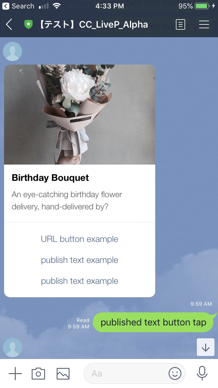
Use LINE cards to send a message with an image, title, text and multiple buttons with actions.
The card contains the following elements:
- Title text
- Subtitle text
- Image
- Up to 4 buttons (LINE limitation) with the following actions:
LINE card example:

JSON Template Properties
Property Name | Description | Type | Required |
|---|
type | Types of basic elements supported by Structured Content framework. If using LINE Cards — type of header element should always be set to "vertical". If using LINE Carousels — type of header element will always be “carousel” | Enum | Y |
alt | Alternative text. Will be shown when the rich message is viewed in a push message. Max: 400 characters | String | Y |
tag | Tag of layout view, must be “generic” for LINE rich content templates. Within basic element objects, will be “title”/”subtitle”, which will indicate what text should be rendered in each of those elements (the title and subtitle have a default style in LINE). | Enum | Y |
elements | Array of elements/layouts. By using elements in your structured content template, you can send basic elements, such as simple text, images or buttons | Elements/Layouts | Y |
text | The message text in a “text” type element | String | Y |
tooltip | Element tooltip. Used also for aira | String | N |
url | Image URL in a “image” type element | String | Y |
style | Basic structured content elements style object (for RCS this element will be ignored since style configuration is not supported) | Style elements | N |
bold | Defines if text will be bold or not. The texts have a default style in LINE and will not be affected by this field. | Boolean | N |
size | Defines the size of the texts of the title and subtitles. In LINE, the texts have a default style and will not be affected by this field. | Enum — small/medium/large | N |
button | Buttons contain click and action fields that define the type of action set on user click operation | Object | N |
click | Click objects contain the action type set on the click operation for each button | Object | N |
action | Actions are a list of applicative user actions on buttons, which will run on the consumer side and will help them to achieve their operation. Button actions for LINE cards and carousels can be set to Publish text or Link | Enum - “publishText”, “link” | N |
Code Example
{
  "type": "vertical",
  "tag": "generic",
  "alt": "these are on sale!",
  "elements": [
    {
      "type": "vertical",
      "elements": [
        {
          "type": "image",
          "url": "https://i.pinimg.com/736x/a0/67/5e/a0675e5161d7ae5be2550987f397a641--flower-shops-paper-flowers.jpg",
          "tooltip": "Flowers"
        },
        {
          "type": "text",
          "tag": "title",
          "text": "Birthday Bouquet",
          "tooltip": "Title"
        },
        {
          "type": "text",
          "tag": "subtitle",
          "text": "An eye-catching birthday flower delivery, hand-delivered by?",
          "tooltip": "subtitle"
        },
        {
          "type": "button",
          "tooltip": "publish text example",
          "title": "publish text example",
          "click": {
            "actions": [
              {
                "type": "publishText",
                "text": "published text button tap"
              }
            ]
          }
        },
        {
          "type": "button",
          "tooltip": "postback example",
          "title": "postback example",
          "click": {
            "metadata": [
              {
                "type": "ExternalId",
                "id": "456"
              }
            ],
            "actions": [
              {
                "type": "publishText",
                "text": "postback button tapped"
              }
            ]
          }
        }
      ]
    }
  ]
}
Carousel Template
Overview
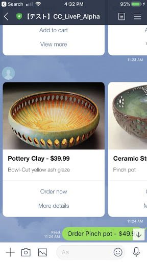
The LINE carousel is a horizontally scrollable carousel of up to 10 rich cards. Each card can include the following elements:
- Title text
- Subtitle text
- Image (which will be placed above the title, subtitle and buttons) - image is not required to be placed in a LINE card
- Up to 3 buttons (LINE limitation) with the following actions:
Note that each carousel card must contain the same number of elements.
Carousel example image:

JSON Template Properties
Property Name | Description | Type | Required |
|---|
type | Types of basic elements supported by Structured Content framework. If using LINE Cards — type of header element should always be set to "vertical". If using LINE Carousels — type of header element will always be “carousel” | Enum | Y |
alt | Alternative text. Will be shown when the rich message is viewed in a push message. Max: 400 characters | String | Y |
tag | Tag of layout view, must be “generic” for LINE rich content templates. Within basic element objects, will be “title”/”subtitle”, which will indicate what text should be rendered in each of those elements (the title and subtitle have a default style in LINE). | Enum | Y |
elements | Array of elements/layouts. By using elements in your structured content template, you can send basic elements, such as simple text, images or buttons | Elements/Layouts | Y |
text | The message text in a “text” type element | String | Y |
tooltip | Element tooltip. Used also for aira | String | N |
url | Image URL in a “image” type element | String | Y |
style | Basic structured content elements style object (for RCS this element will be ignored since style configuration is not supported) | Style elements | N |
bold | Defines if text will be bold or not. The texts have a default style in LINE and will not be affected by this field. | Boolean | N |
size | Defines the size of the texts of the title and subtitles. In LINE, the texts have a default style and will not be affected by this field. | Enum — small/medium/large | N |
button | Buttons contain click and action fields that define the type of action set on user click operation | Object | N |
click | Click objects contain the action type set on the click operation for each button | Object | N |
action | Actions are a list of applicative user actions on buttons, which will run on the consumer side and will help them to achieve their operation. Button actions for LINE cards and carousels can be set to Publish text or Link | Enum - “publishText”, “link” | N |
Code Example
{
  "type": "carousel",
  "padding": 10,
  "alt": "Check these out!",
  "elements": [
    {
      "type": "vertical",
      "tag": "generic",
      "elements": [
        {
          "type": "vertical",
          "elements": [
            {
              "type": "image",
              "url": "https://i.pinimg.com/736x/27/9a/d7/279ad7bfd3fe7ee87638a5ce064d25a5---year-old-girl-cut-flowers.jpg",
              "tooltip": "Flowers"
            },
            {
              "type": "text",
              "tag": "title",
              "text": "Birthday Bouquet",
              "tooltip": "Birthday Bouquet"
            },
            {
              "type": "text",
              "tag": "subtitle",
              "text": "An eye-catching birthday flower delivery, hand-delivered by?",
              "tooltip": "An eye-catching birthday flower delivery, hand-delivered by?"
            },
            {
              "type": "button",
              "tooltip": "Add to cart",
              "title": "Add to cart",
              "click": {
                "actions": [
                  {
                    "type": "publishText",
                    "text": "Add to cart pressed"
                  }
                ]
              }
            },
            {
              "type": "button",
              "tooltip": "Add to cart",
              "title": "Add to cart",
              "click": {
                "actions": [
                  {
                    "type": "link",
                    "name": "Flowers",
                    "uri": "https://www.pinterest.com/lyndawhite/beautiful-flowers/"
                  }
                ]
              }
            }
          ]
        }
      ]
    },
    {
      "type": "vertical",
      "tag": "generic",
      "elements": [
        {
          "type": "vertical",
          "elements": [
            {
              "type": "image",
              "url": "https://i.pinimg.com/736x/cf/05/dc/cf05dc6becf9d387707597a788250a1c--blue-bridal-bouquets-bridal-flowers.jpg",
              "tooltip": "Flowers"
            },
            {
              "type": "text",
              "tag": "title",
              "text": "Birthday Bouquet",
              "tooltip": "Birthday Bouquet"
            },
            {
              "type": "text",
              "tag": "subtitle",
              "text": "An eye-catching birthday flower delivery, hand-delivered by?",
              "tooltip": "An eye-catching birthday flower delivery, hand-delivered by?"
            },
            {
              "type": "button",
              "tooltip": "Postback",
              "title": "Postback",
              "click": {
                "metadata": [
                  {
                    "type": "ExternalId",
                    "id": "456"
                  }
                ],
                "actions": [
                  {
                    "type": "publishText",
                    "text": "postback button tapped"
                  }
                ]
              }
            },
            {
              "type": "button",
              "tooltip": "Add to cart",
              "title": "Add to cart",
              "click": {
                "actions": [
                  {
                    "type": "link",
                    "name": "Flowers",
                    "uri": "https://www.pinterest.com/lyndawhite/beautiful-flowers/"
                  }
                ]
              }
            }
          ]
        }
      ]
    },
    {
      "type": "vertical",
      "tag": "generic",
      "elements": [
        {
          "type": "vertical",
          "elements": [
            {
              "type": "image",
              "url": "https://i.pinimg.com/736x/27/9a/d7/279ad7bfd3fe7ee87638a5ce064d25a5---year-old-girl-cut-flowers.jpg",
              "tooltip": "Flowers"
            },
            {
              "type": "text",
              "tag": "title",
              "text": "Birthday Bouquet",
              "tooltip": "Birthday Bouquet"
            },
            {
              "type": "text",
              "tag": "subtitle",
              "text": "An eye-catching birthday flower delivery, hand-delivered by?",
              "tooltip": "An eye-catching birthday flower delivery, hand-delivered by?"
            },
            {
              "type": "button",
              "tooltip": "Add to cart",
              "title": "Add to cart",
              "click": {
                "actions": [
                  {
                    "type": "publishText",
                    "text": "Add to cart pressed"
                  }
                ]
              }
            },
            {
              "type": "button",
              "tooltip": "Add to cart",
              "title": "Add to cart",
              "click": {
                "actions": [
                  {
                    "type": "link",
                    "name": "Flowers",
                    "uri": "https://www.pinterest.com/lyndawhite/beautiful-flowers/"
                  }
                ]
              }
            }
          ]
        }
      ]
    },
    {
      "type": "vertical",
      "tag": "generic",
      "elements": [
        {
          "type": "vertical",
          "elements": [
            {
              "type": "image",
              "url": "https://i.pinimg.com/736x/06/dc/b3/06dcb32c02c30a035b189ad267674f1c--pink-bouquet-floral-bouquets.jpg",
              "tooltip": "Flowers"
            },
            {
              "type": "text",
              "tag": "title",
              "text": "Birthday Bouquet",
              "tooltip": "Birthday Bouquet"
            },
            {
              "type": "text",
              "tag": "subtitle",
              "text": "An eye-catching birthday flower delivery, hand-delivered by?",
              "tooltip": "An eye-catching birthday flower delivery, hand-delivered by?"
            },
            {
              "type": "button",
              "tooltip": "Postback",
              "title": "Postback",
              "click": {
                "metadata": [
                  {
                    "type": "ExternalId",
                    "id": "890"
                  }
                ],
                "actions": [
                  {
                    "type": "publishText",
                    "text": "postback button tapped"
                  }
                ]
              }
            },
            {
              "type": "button",
              "tooltip": "Add to cart",
              "title": "Add to cart",
              "click": {
                "actions": [
                  {
                    "type": "link",
                    "name": "Flowers",
                    "uri": "https://www.pinterest.com/lyndawhite/beautiful-flowers/"
                  }
                ]
              }
            }
          ]
        }
      ]
    },
    {
      "type": "vertical",
      "tag": "generic",
      "elements": [
        {
          "type": "vertical",
          "elements": [
            {
              "type": "image",
              "url": "https://i.pinimg.com/736x/a8/28/26/a8282621d4fe30717de5fab28975b7a3--pink-peonies-pink-flowers.jpg",
              "tooltip": "Flowers"
            },
            {
              "type": "text",
              "tag": "title",
              "text": "Birthday Bouquet",
              "tooltip": "Birthday Bouquet"
            },
            {
              "type": "text",
              "tag": "subtitle",
              "text": "An eye-catching birthday flower delivery, hand-delivered by?",
              "tooltip": "An eye-catching birthday flower delivery, hand-delivered by?"
            },
            {
              "type": "button",
              "tooltip": "Add to cart",
              "title": "Add to cart",
              "click": {
                "actions": [
                  {
                    "type": "publishText",
                    "text": "Add to cart pressed"
                  }
                ]
              }
            },
            {
              "type": "button",
              "tooltip": "Add to cart",
              "title": "Add to cart",
              "click": {
                "actions": [
                  {
                    "type": "link",
                    "name": "Flowers",
                    "uri": "https://www.pinterest.com/lyndawhite/beautiful-flowers/"
                  }
                ]
              }
            }
          ]
        }
      ]
    }
  ]
}
Quick Replies Template
Overview
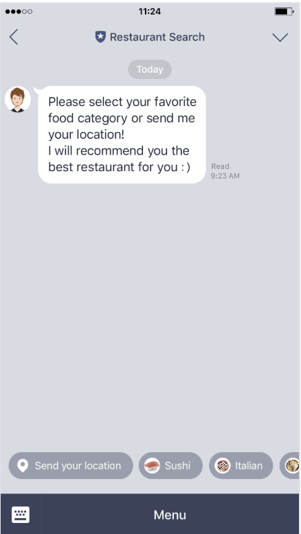
When a user receives a message that contains quick reply buttons from a brand, those buttons appear at the bottom of the chat screen on LINE messenger. The user can simply tap one of the buttons to reply to the brand, the response will be captured and shared back to the agent.
A LINE quick reply button consists of the question/statement text and a set of up to 13 buttons and that each contain:
- Title text (including emojis, max. 20 characters)
- Publish text click action
Quick reply example image:

JSON Template Properties
Property Name | Description | Type | Required |
|---|
type | Types of basic elements supported by Structured Content framework. Will always be set to "quickReplies" | Enum | Y |
itemsPerRow | The number of items that will be set on each row. For LINE quick replies this property is ignored, since LINE has a fixed set of one row. | Integer | Y |
replies | Array of quick replies sent to the consumer | | Y |
button | Buttons contain click and action fields that define the type of action set on user click operation | Object | Y |
click | Click objects contain the action type set on the click operation for each button | Object | Y |
action | Actions are a list of applicative user actions on buttons, which will run on the consumer side and will help them to achieve their operation. Button actions for LINE quick replies can be set to “publishText” only | Enum - “publishText”” | N |
Code Example
{
  "type": "quickReplies",
  "itemsPerRow": 4,
  "replies": [
    {
      "type": "button",
      "tooltip": "yes I do",
      "title": "yes",
      "click": {
        "actions": [
          {
            "type": "publishText",
            "text": "yep"
          }
        ]
      }
    },
    {
      "type": "button",
      "tooltip": "hmmm maybe?",
      "title": "hmmm maybe?",
      "click": {
        "actions": [
          {
            "type": "publishText",
            "text": "hmmm maybe?"
          }
        ]
      }
    },
    {
      "type": "button",
      "tooltip": "what is that?",
      "title": "what is that?",
      "click": {
        "actions": [
          {
            "type": "publishText",
            "text": "what is that?"
          }
        ]
      }
    },
    {
      "type": "button",
      "tooltip": "whattttttt",
      "title": "whatttttt",
      "click": {
        "actions": [
          {
            "type": "publishText",
            "text": "whatttttt"
          }
        ]
      }
    },
    {
      "type": "button",
      "tooltip": "no",
      "title": "nope",
      "click": {
        "actions": [
          {
            "type": "publishText",
            "text": "nope"
          }
        ]
      }
    },
    {
      "type": "button",
      "tooltip": "no way!",
      "title": "no way!",
      "click": {
        "actions": [
          {
            "type": "publishText",
            "text": "no way!"
          }
        ]
      }
    }
  ]
}
Limitations
General limitations
- Line does not guarantee message order and some message types might take longer to send than others. Therefore a small timeout is recommended when sending multiple successive messages.
Element limitations
Carousel Template cards have a maximum of 3 buttonsCard Template have a maximum of 4 buttons- Carousels have a maximum of 10 scrollable cards
- Quick replies have a maximun of 13 chips
Character limitations
- Title has a max of 40 characters
- Subtitle:
- Without image and title — subtitle can be up to 160 chars
- With image and title — subtitle can be up to 60 chars
Styling limitations
- Fonts, font colors or background color can’t be configured — default LINE font and colors will be used
Image limitations
- Image URL has a limit of 1000 characters.
- Image URL must be HTTPS
- File type can only be JPEG or PNG
- Image max width: 1024px
- Max size - 1MB
Error conditions
- An agent or bot will receive an error when trying to send LINE Structured Content elements with the following character limitations:
- If title text exceeds 40 characters, or subtitle with image exceeds 60, or if subtitle without image exceeds 160
- If structured content Map element is applied
Ready to launch the next channel? Click here to proceed.